IN4MATX 286 · Assignment 3: Designing AI Interactions
Staying in the Tool and Tutor Zone: An AI Interaction Concept
By Shawn Farnum
In Assignment 1, I argued that AI should remove roadblocks without removing the process. In Assignment 2, I mapped out how easily that process disappears anyway: a designer can hand an AI more and more authority without noticing, until the AI is quietly making calls the designer should be making. This assignment moves that argument into a design. Rather than writing about the problem further, I will design an interaction concept meant to resist it.
The concept, which I will call Design Tutor, is intended for early-career designers who hit a wall mid-project and reach for AI without much to push back with. This is the exact pattern I described in Assignment 2, in which someone asks AI to create the direction instead of bringing one. The panels below walk through the intended flow of a single conversation, screen by screen, explaining what will happen at each step and why it is designed that way.
Overview
The six-step method
What will happen
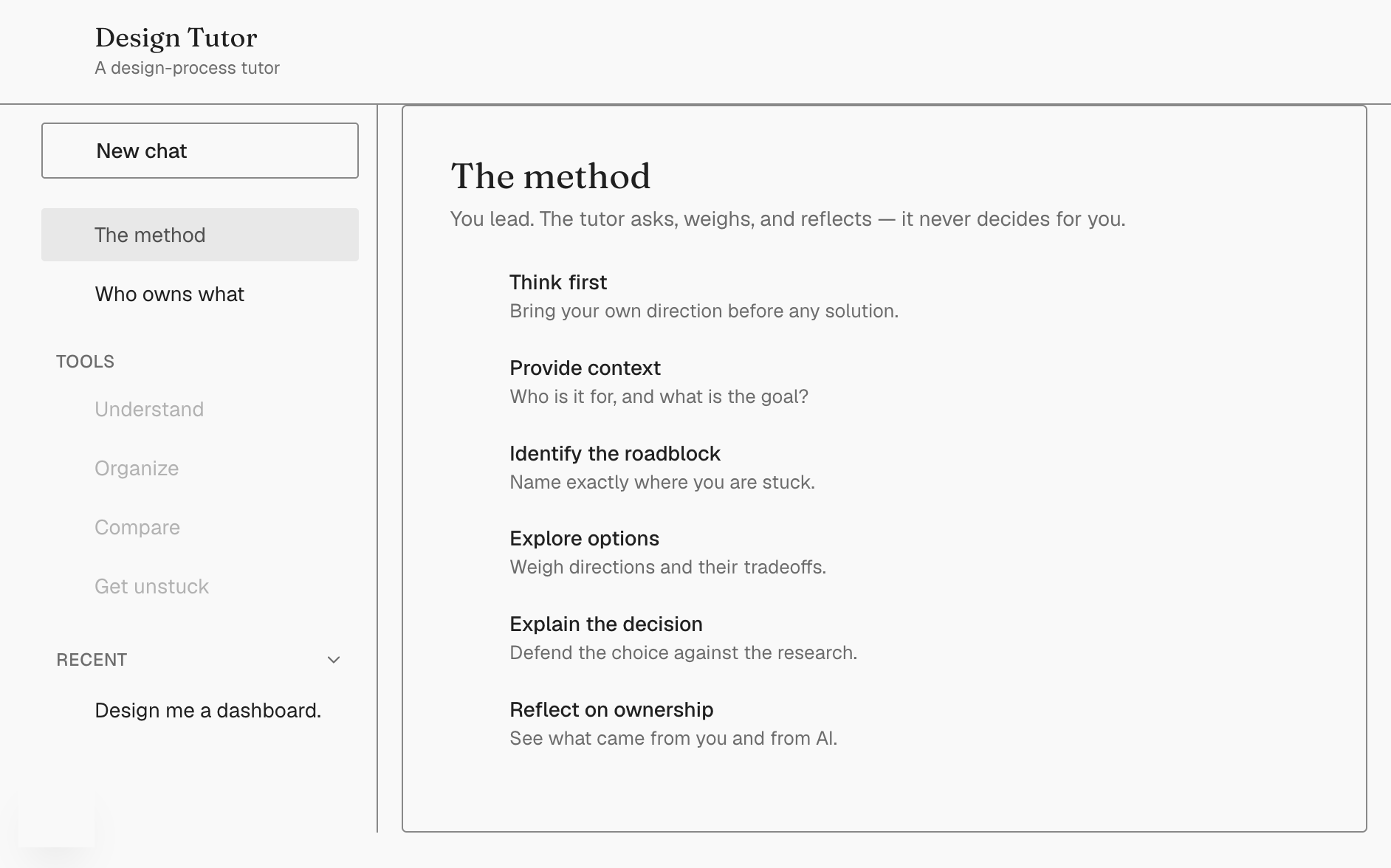
Every conversation will follow the same six steps, shown here in the sidebar: think first, provide context, identify the roadblock, explore options, explain the decision, and reflect on ownership.
Why it is designed this way
This structure is a direct translation of the five best practice steps from my Assignment 2 progression map: research and think first, ask pointed questions, compare the output, decide and execute, and explain rationale. A sixth step, reflect, will be added to make the ownership split visible after the fact.
State 1
Refusing a broad prompt
What will happen
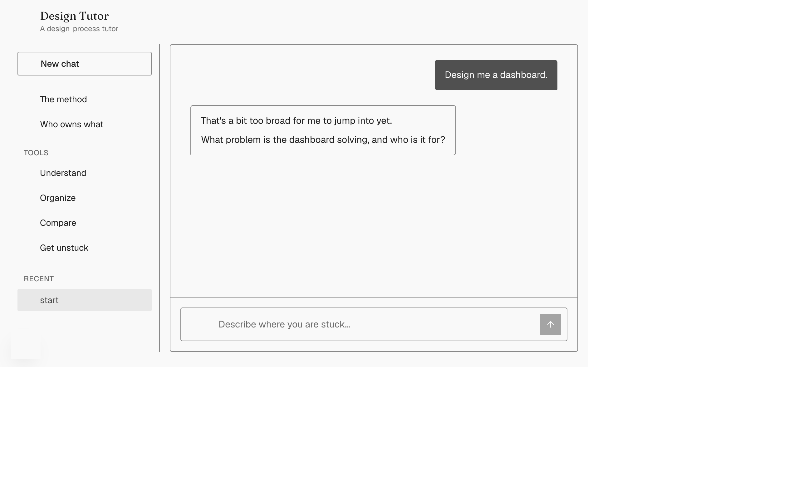
When a user opens with something like "Design me a dashboard," the assistant will not design anything. It will explain that the request is too broad and ask what problem the dashboard solves, who it is for, and what has already been figured out.
Why it is designed this way
This responds to the early-career pattern I flagged in Assignment 2: asking AI to create the direction instead of bringing one. Wadinambiarachchi et al. (2024) found that people fixate on AI-generated examples once they have seen them, so the interaction is designed to get the designer's own thinking on the table before the AI offers anything at all.
State 2
Providing context and picking a mode
What will happen
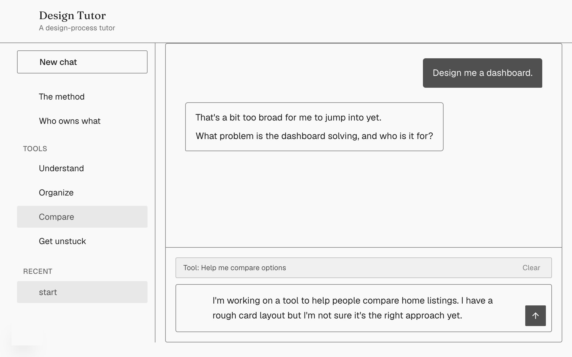
The user will select one of four support modes, such as Compare, and provide real context: who the users are, the goal, what has already been sketched, and any constraints such as an existing design system.
Why it is designed this way
Four modes will exist instead of one generic chat because a first year designer and someone five years into their career need different things from the same tool, a point drawn from both Assignment 1 and Assignment 2.
State 3
Confirming understanding before advising
What will happen
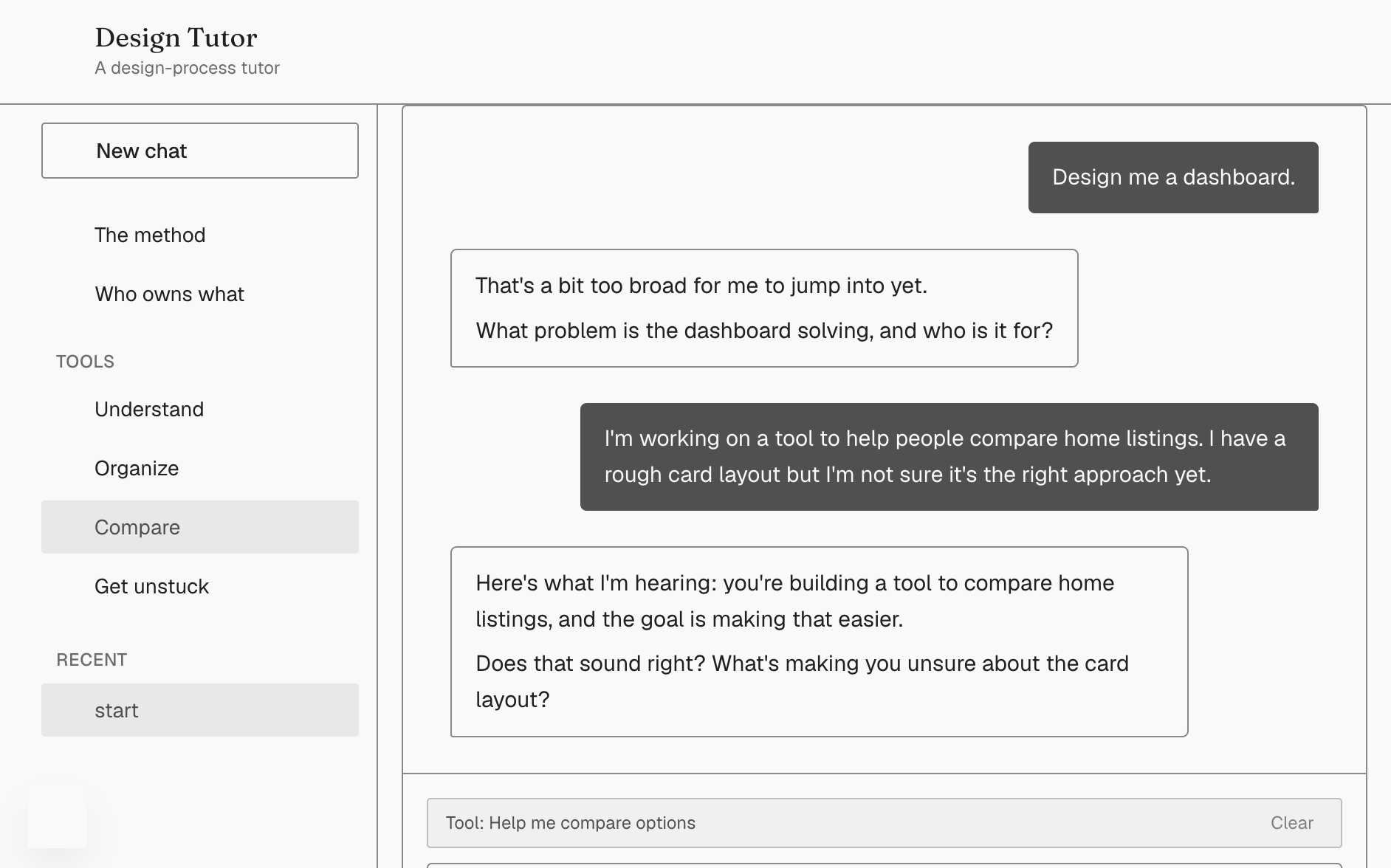
Before offering anything, the assistant will play back what it understands the project to be and ask a clarifying question rather than jump to a solution.
Why it is designed this way
This is the grounding step. It will make the AI's understanding checkable instead of assumed, which matters because Nazaretsky et al. (2025) found that trust depends on more than whether a tool works. It also depends on whether the person can see and correct what the tool believes it knows.
State 4
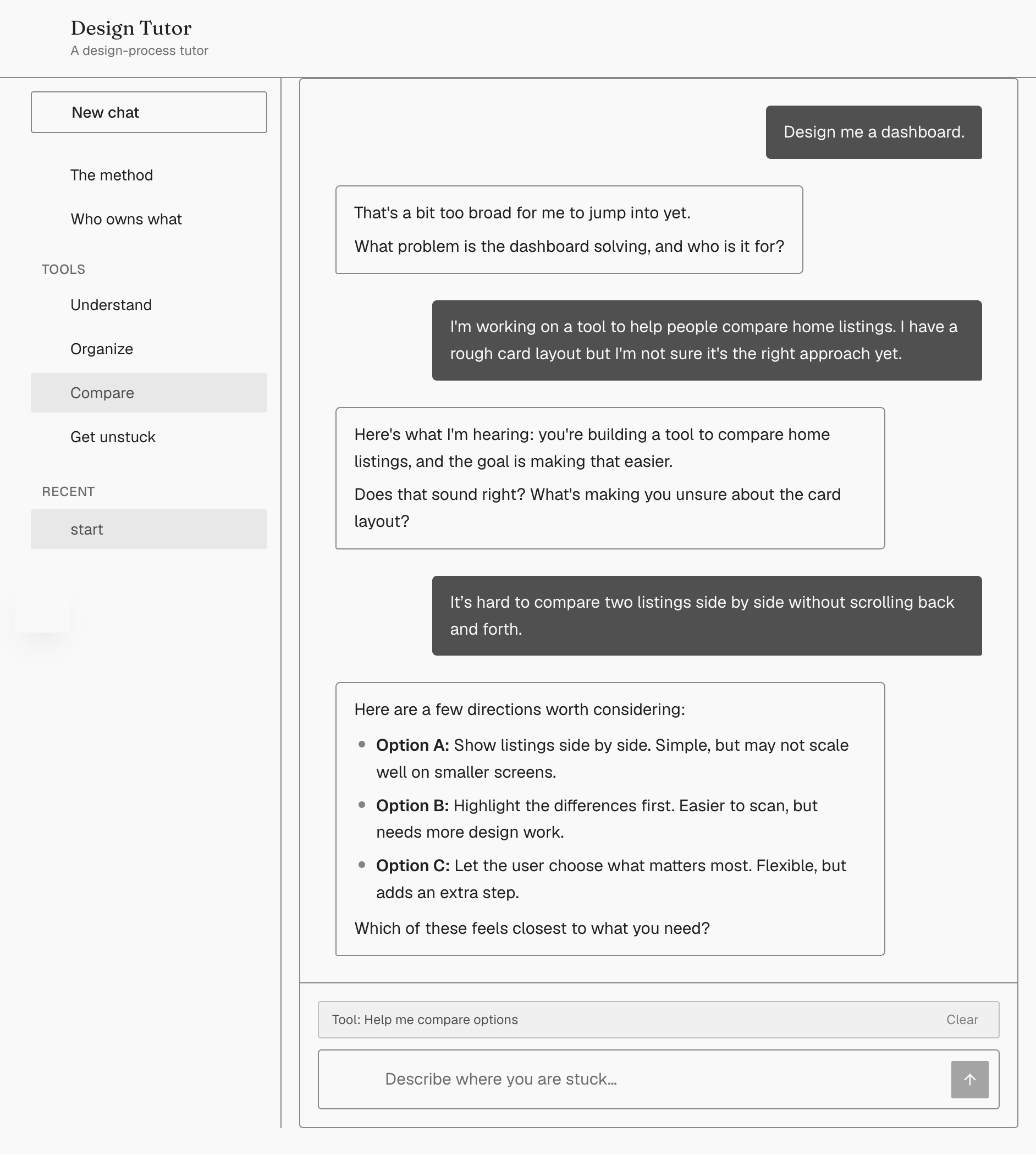
Options with tradeoffs, not one answer
What will happen
The assistant will offer three directions, each with a named strength and a named cost, and will flag explicitly if an option does not match the existing design system.
Why it is designed this way
Fu et al. (2024) found that AI-assisted design was rated as more novel but not more useful or better aligned with the brief. Novelty alone is not the goal, so the interaction is designed to force a side-by-side comparison instead of offering a single confident answer.
State 5
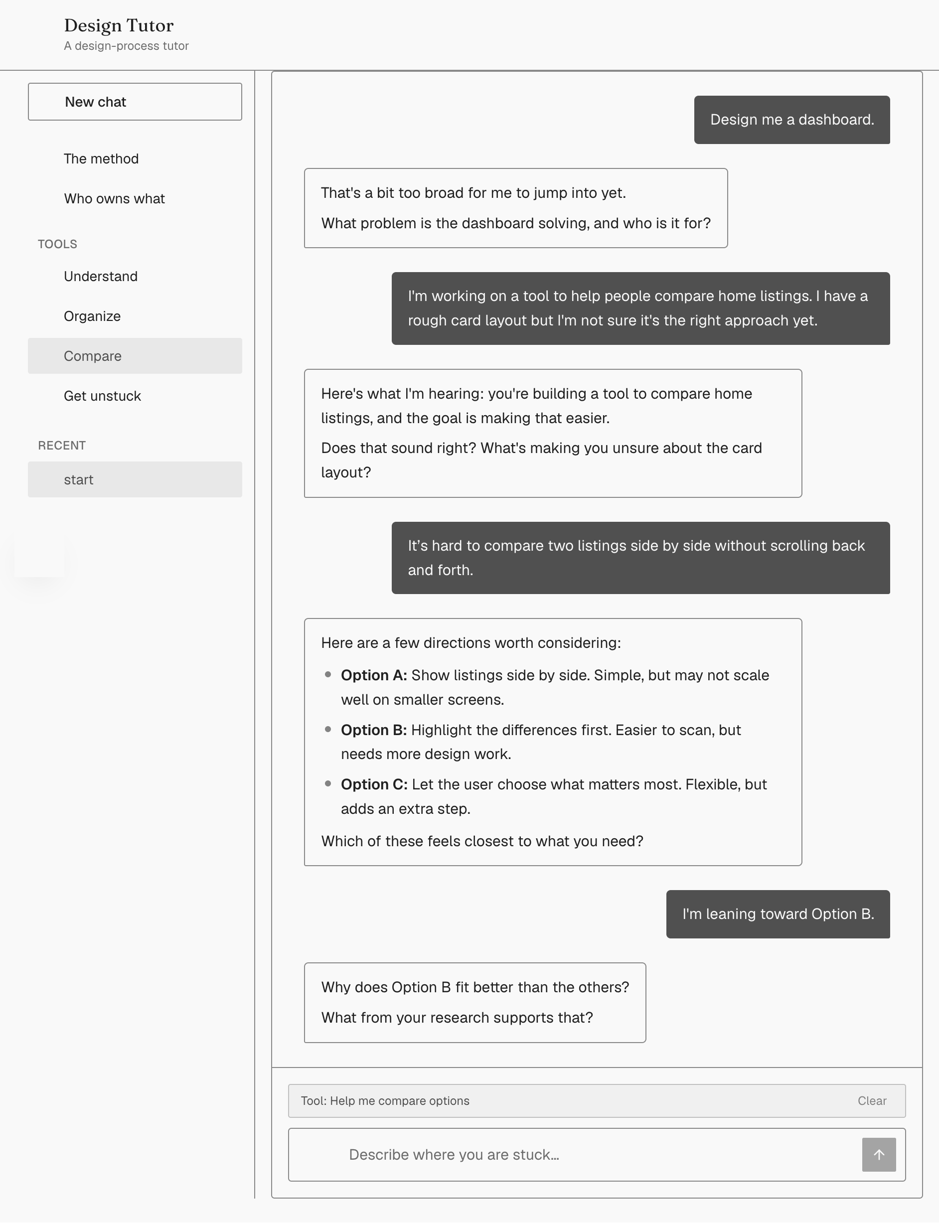
Defending the decision
What will happen
Once the user picks a direction, the assistant will not simply move on. It will ask why the direction fits the research and the goal, and will push back gently if the first answer is closer to a feeling than a reason.
Why it is designed this way
This answers a line from my Assignment 1 paper directly: "this is what ChatGPT told me" is not a design rationale. If someone cannot explain why a direction fits the research, the interaction will push on that instead of letting it slide.
State 6
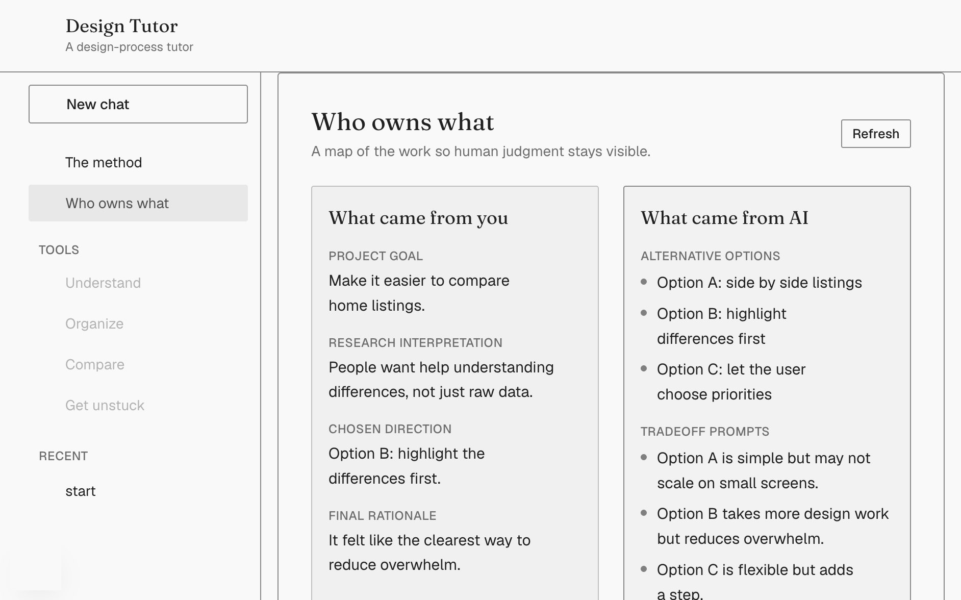
Reflecting on ownership
What will happen
A separate screen will split the entire conversation into what came from the designer, including the goal, the research interpretation, the chosen direction, and the rationale, and what came from the AI, including the alternatives, the tradeoffs, and the questions it asked.
Why it is designed this way
This is intended to make Zhu et al.'s (2024) human-led, shared, and AI-led collaboration patterns visible instead of invisible. Their study found that students sometimes let AI lead without fully noticing. Showing what came from whom, turn by turn, is meant to make that drift noticeable in the moment rather than realized later.
Who this concept leaves out
The honest version of who this concept leaves out begins with an assumption. It assumes someone comfortable typing out their reasoning in English and confident enough to defend a decision in writing. Someone who struggles with that, or who is not a native speaker, may find this feels more like an interrogation than support. Cost is also not solved. Running this on a paid model raises the same gap Assignment 2 identified, in which paid tools favor students who can afford them.
One accessibility risk is worth naming directly rather than leaving implicit. If the navigation only works on larger screens, it will disappear entirely on a phone with no fallback. That is the exact risk Assignment 2 warned about: AI removing friction in one part of the workflow while an inaccessible interface creates a new barrier right next to it. Any implementation of this concept will need to test for that specifically and provide a mobile-friendly path to the same navigation, not just confirm that the desktop layout works.
The ownership map will also be generated by a model, which means the same skepticism from Assignment 1 applies here as well. Someone using it will still need to check that the map reflects what they actually said, rather than what an AI decided their words meant. A way to verify that is not yet part of this concept.
AI can hand a designer everything except the reason. This concept is designed to keep asking for it anyway.
References
Fu, Y., Bin, H., Zhou, T., Wang, M., Chen, Y., Lai, Z. G. D. C., Wobbrock, J. O., & Hiniker, A. (2024). Creativity in the age of AI: Evaluating the impact of generative AI on design outputs and designers' creative thinking [Preprint]. arXiv. https://doi.org/10.48550/arXiv.2411.00168
Nazaretsky, T., Mejia-Domenzain, P., Swamy, V., Frej, J., & Käser, T. (2025). The critical role of trust in adopting AI-powered educational technology for learning: An instrument for measuring student perceptions. Computers and Education: Artificial Intelligence, 8, 100368. https://doi.org/10.1016/j.caeai.2025.100368
Wadinambiarachchi, S., Kelly, R. M., Pareek, S., Zhou, Q., & Velloso, E. (2024). The effects of generative AI on design fixation and divergent thinking. In Proceedings of the 2024 CHI Conference on Human Factors in Computing Systems. Association for Computing Machinery. https://doi.org/10.1145/3613904.3642919
Zhu, G., Sudarshan, V., Kow, J. F., & Ong, Y. S. (2024). Human-generative AI collaborative problem solving: Who leads and how students perceive the interactions. arXiv preprint.
AI Use Statement
I used AI to brainstorm ideas for the wireframe screenshots shown above and to help the descriptions of each panel flow better. The concept, the interaction design, and the reasoning behind each decision were mine.